15 Best Tools And Libraries For Responsive Web Design

We all want that incredible responsive website that flows smoothly and fluidly and offers up a great experience for the end-user. We also want our sites to adjust to every width and siplay size and allow everybody to be able to access it no matter what device they are using. This is something that is becoming vital for modern websites and is definitely something website designers and developers need to think about when designing these sites.
Therefore, we’ve come up with the 15 best tools and libraries for responsive web design to allow you to optimise your website for every screen size for every browser and to make the most fluid, smooth and fastest experience possible. We hope these 15 tools and libraries help!
Columnal
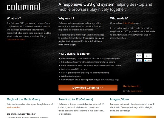
Columnal is one of the key plugins when it comes to responsive design as it allows your site to become very adaptable to changing screen sizes and windows sizes. It’s the essential CSS tool for help mobile and desktop sites look as good as one another.
Bootstrap
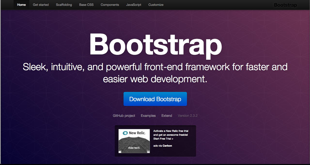
Anyone who uses WordPress will have heard of Bootstrap as it offers a great platform for which to begin the designing of your website with thousands of free elements, layouts, javascript tools and more.
Responsive Sketchsheets
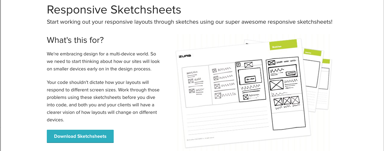
Responsive sketchsheets allows you to begin working out your final design of the website with a basic wireframe of your apps. It allows you to view your site in a desktop and mobile view allowing you to clearly see how each version of your site will look.
Style Tiles

Style tiles describes itself as “for when a moodboard is too vague and a comp is too literal.” If you’ve ever found yourself in this position then you should check out Style Tiles and see if they help you convey to a client your final design hopes for your website.
Adapt.js
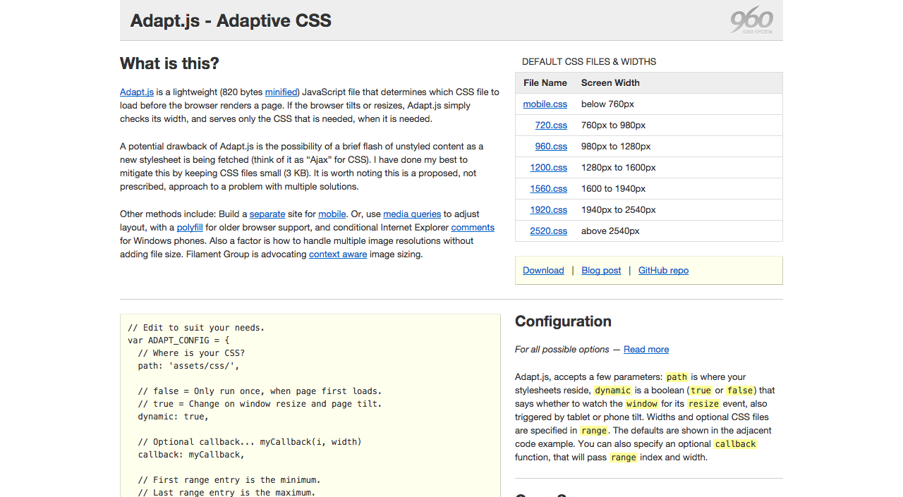
Adapt.js is a lightweight JavaScript file that intelligently works out which CSS file to load before the browser renders a page. Simply put, whenever the browser is tilted or adjusted , Adapt.js simply checks its width, and serves only the CSS that is needed, when it is needed.
TinyNav.js
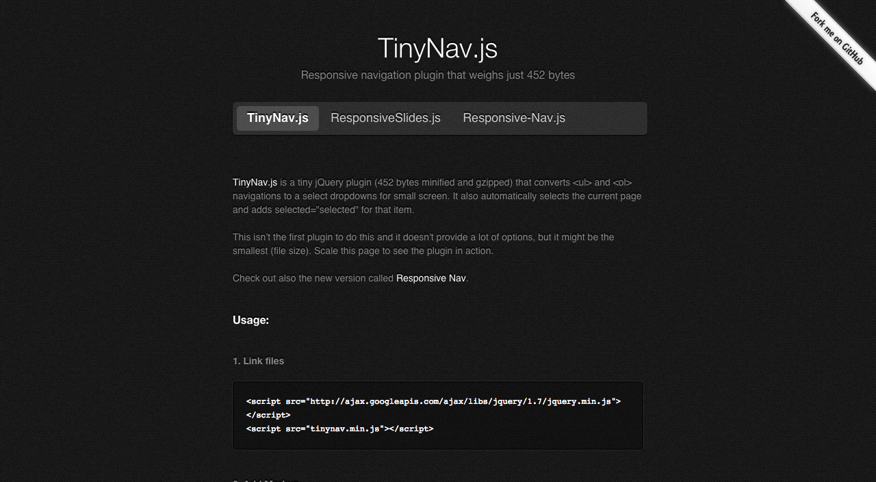
TinyNav.js is a great jQuery plugin for anyone who is looking to have their website adapt to mobile screens. It allows you to set menus to adjust to more mobile-friendly drop-down menus when they are shrunk to the smaller screen!
Wookmark jQuery Plugin

The Wookmark jQuery Plugin is a plugin that allows your page to adapt to the width of the page and add more columns if necessary or less depending on the width of the browser/page/window the user is using.
ProtoFluid
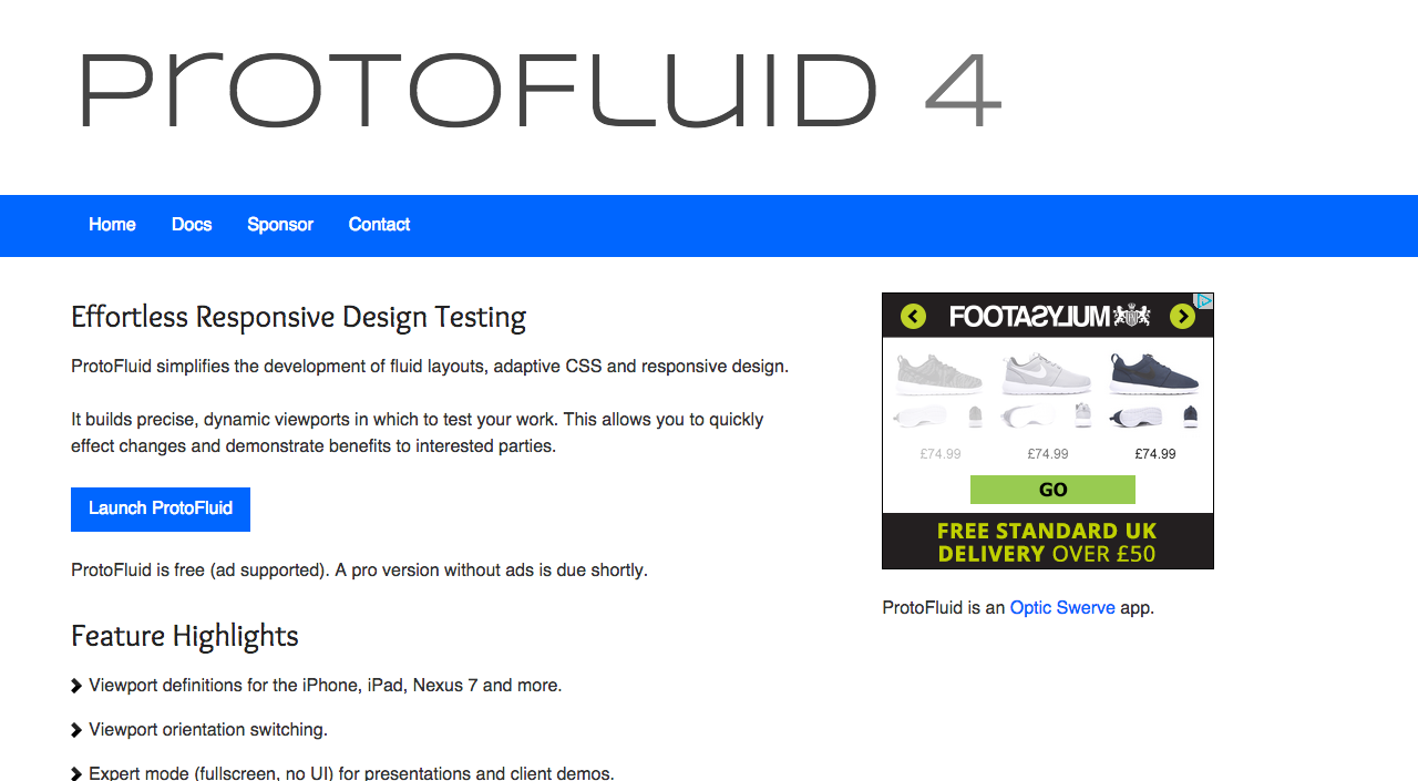
ProtoFluid is a clever little online desktop application you can use to test your website on different screen sizes to see how it adapts. You simple type in the URL and then start playing around with the rotation and width in pixels.
Responsivepx
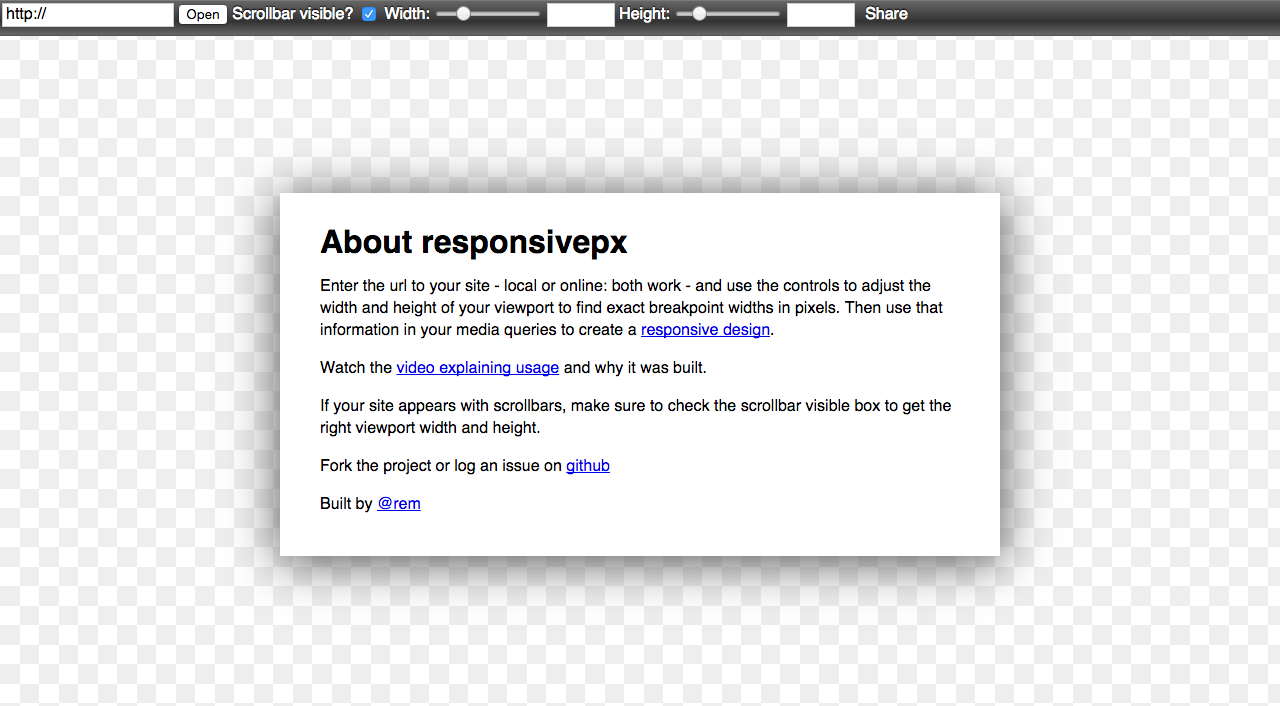
If you’re looking to be specific with how width and high your website can go, then responsivepx offers a very similar emulator but it allows you to define each individual pixel. This would be helpful for those looking for a certain breaking point to which their website starts becoming a different layout.
Responsinator

If you’re looking to enable your website for a more specific sized device such as the latest iPhone or a certain Android device then Responsinator is the best service for you as it offers you the ability to simply type your website’s URL in and then select from different devices to text your ‘site on.
Blueberry

Blueberry image slider is a simple jQuery that allows you to easily implement an image slider into your website. With image sliders becoming more and more prevalent with modern web designs, it’s great to have a pre-made one for you.
Elastislide
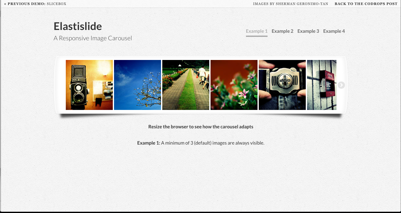
If you’re looking for an image carousel that optimises and cleverly adjusts itself based on the width of the display then Elastislide is the best choice for you. It changes the amount of images shown as you lessen the width but will always show three images and the actual size of the element will just grow smaller from then on.
Adaptive Images
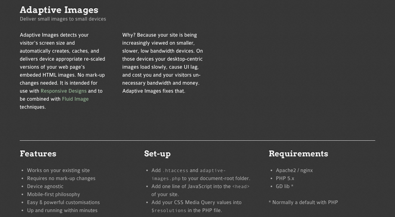
Adaptive Images does exactly what it says on the tin and cleverly changes your image size to the width of the browser. To do this it automatically creates, caches, and delivers device appropriate re-scaled versions of your web page’s embedded HTML images.
Responsive Calculator
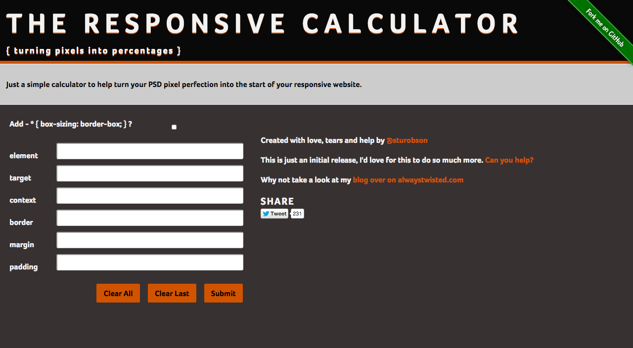
If you find yourself needing to calculate and translate pixels into percentages a lot then this calculator is the exact tool you need!
FitVid.js
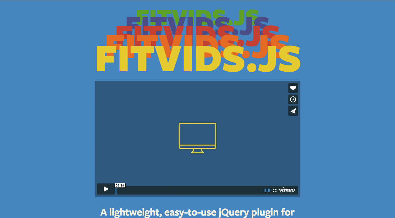
FitVid.js is another jQuery that adapts your content for your screen. This jQuery specifies in videos which are often a key part of modern websites as they feature a lot of video content. No matter the width of the browser, the image will resize to the appropriate size.