5 Tips and Tricks To Enhance Your User Experience with Micro Interactions

We live in a world where design has absolutely taken over every sector of our digital lives. We have websites that incorporate such beauty that they could almost be considered art. We have mobile phone user interfaces that often result in users playing around with the application to see it’s fun animations rather than the content itself. One of the most important things to ensuring that your mobile application, website or whatever you’re designing looks great is Micro Interactions. Micro interactions are the result of what happens when you tap on buttons within an application.
Therefore, we thought we here at Geeks Zine would give a rundown of five great tips and tricks to enhance your user experience with micro interactions. These tips and tricks should be things you think about when designing your application and should be what you ask your testers to consider when testing the application in its Beta stages.

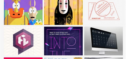
Courtesy of Dribbble
Make It Obvious What Is Interactive
One of the first and foremost thoughts that should be in your mind when you begin designing your application, especially your iconography and final layout is making sure that what can be interacted with is obvious to the user. This could be done in quite a few different ways. You could make everything that can’t be interacted with seem behind the interactive buttons. You could choose to highlight the interactive objects by using a different colour palette for them than the rest of your applications. This is something we’d recommend asking your testers when you have this application run through its testing process. Ask the tester to guess which the interactive options are and then ask them to try and interact with everything they see and see if they were correct in their predictions.

Courtesy of Dribble
Keep Your Users Aware Of What Is Happening
Something that is very important when considering micro interactions is that these interactions can sometimes result in the user having to wait for something to load. It’s very important to keep the user up to date with what they’re waiting for and, if you can, how much longer they’ll be waiting for. A loading bar or some form of loading screen would be a good process for this. Obviously, the best applications can cut down on loading times significantly, but if it’s web-based then sometimes that’s not in your control and so you’ve got keep the user in the loop as to what they’re currently waiting for and how much longer to expect to wait.

Courtesy of Dribbble
Consider Interaction Highlights
What we mean by interaction highlights is the fact that when the user clicks on something, sometimes the page doesn’t change, simply a button changes to save loading time and space in an app. In this case, you want some form of animation to happen so that the user knows that this change has happened. In addition, it’s always nice for the user to recognize the fact that you’ve implemented this feature which saves them loading another page or using up more space in their app.
Courtesy of Dribbble
Stay Context-Aware
Staying context-aware is something that Google is pushing really hard with their Material Design guidelines. They have asked that any applications that use the Material Design guidelines have interactions that are context-aware. If you’re unsure what this means, it simply means that when your user taps on something and it takes them to a different area, it should show an animation taking them to that area. This can be as simple as having a drop-down box that opens up when you navigate to it. But it also opens up the path of introducing some fun transitions and animations into your application to let your user know where they’re going and where they’ve come from.

Courtesy of Dribbble
Think Outside The Box
Catching people’s eye and having them stay within your application and actually wanting to interact with it is something that can really make an application good. There’s no better way to do this than to think outside of the box. When it comes to your design, think about what content you want to be shown and then try and draw out 3 different layouts or ways you can present this information to your user. This way, you’re more likely to come up with plenty of different looks and layouts. Once you’ve got your differed layout, you can then add in animations to suit the style of the layout, finishing off a hopefully beautiful piece of interaction design.