10 Unique Web Design Tips And Tricks To Captivate Your Audience

With so many different websites being created, uploaded and used these days, in 2019 it’s hard to stand out in the crowded space and so maybe you’re looking for some unique webdesign tips and tricks for 2020 to captivate your audience. Well, this title suggest you’re reading the right article!
There’s many different aspects of the website that web designers have to consider when thinking about the user-end performance. It has to work well but also look good at the same time which is something that a lot of websites struggle to find the balance between. We hope these 10 tips and tricks help you create the best website you can.
Ensure a Responsive feel
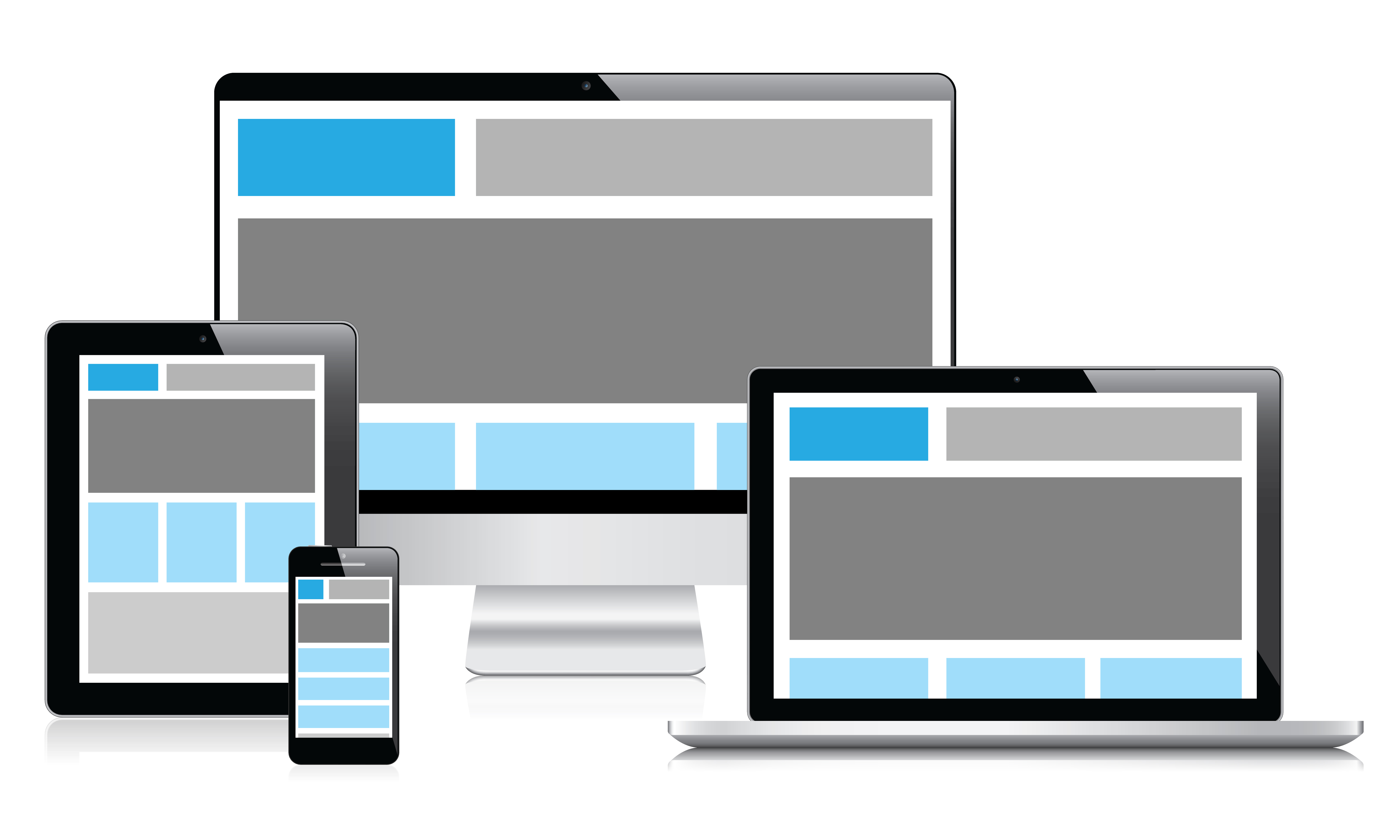
The first and foremost rule of any website is to ensure that it works well. This means making sure that the website scrolls smoothly, zooms smoothly, loads quickly and reacts quickly. You should also make sure that your website is properly optimised for all screen sizes as this is essential in this modern day and age. It’s essential that your site looks as good on a 27″ 5k monitor as it does on a 4″ low-res mobile phone display. These are some things to remember when trying to ensure your website is as responsive as possible.
Use Large Imagery
Large imagery has become a massive part of modern web design and is something that can really capture a user’s attention. If your landing page includes a large image of your product or a relatable image of the service you offer then they are instantly pulled in and wish to read about what it is you have to offer.
Large imagery can be used throughout the whole website, even for blog posts as it’s something that is crucial to keeping modern design, along with ensuring you have the right font to go with your images.
Use Clean and Modern Fonts
Speaking of fonts, it’s very important in this modern day and age of web design to ensure you have the best font to represent your website. If you’re trying to go with a modern and minimal website themee then try and use sans-serif, thin fonts for the titles and then a slightly thicker version of the same font for the paragraph text.
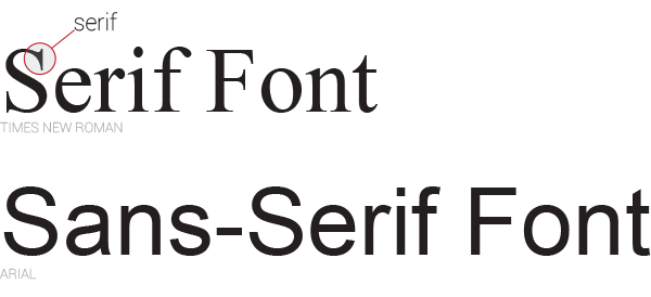 However, if you’re trying to give your website a different feel and appearance however, we’d recommend trying out different fonts or doing some research on other website that are using a similar theme or selling a similar service/product to you. It’s always useful to have a look around to see what works well and what doesn’t.
Summarise your Text
Speaking of paragraph texts, never use them on a landing page. If you use large amounts of text on the first page that your audience sees then they will instantly hit the back button as they don’t want to commit to a paragraph of text if they aren’t yet drawn in.
When it comes to your landing page, use as little words as possible to describe your product, if you can, keep it down to one line/sentence. Once you’ve grabbed their attention, then allow them to explore more clicking on links that will take them to a page with more depth about the subject.
Have a modern Logo and have that link to your home page
When it comes to modern websites and especially new businesses looking to build websites, it’s important to ensure you have a modern logo that not only looks good but works on the website how it should. It’s a very natural action to hit the logo on a business’ website to return to the home page, it’s something a lot of people instinctively do.
 Choose a Colour Palette of as few colours as possible and stick to it
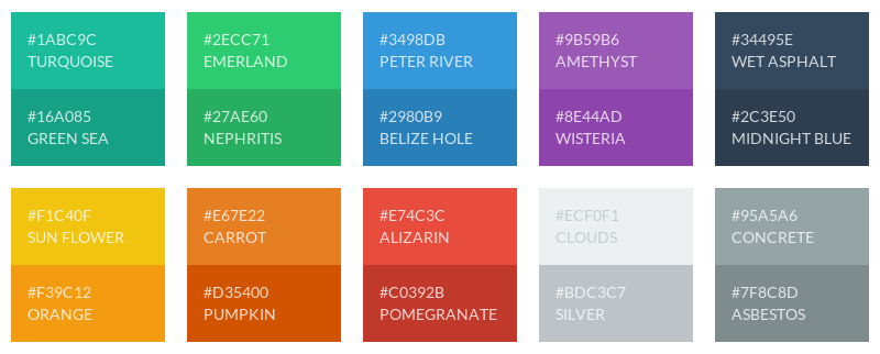
Ensuring your logo and other parts of your website look like they’re all part of the same website is crucial. To do this, we recommend making your logo out of no more than three colours and then trying to stick to these three colours for the rest of the website. Only deferring from these three colours when using body text or potentially trying to add interactivity to your site.
Use Professional Photographs

There’s nothing more that turns people off from a website than when they scroll down and see a photo that looks like it was taken with a potato. If you’re going to include imagery (we hope large imagery) then it HAS to look good. If that involves getting a professional in, or at least someone with something more than a smartphone to come in then that may be an expense you’re going to have to make. It will be worth it in the end!
Try something a bit different
Why not try something a bit different than just images and text? Why not try involving a large video as your background or maybe include some interactivity such as buttons or sections of the page that let your manipulate things. These are obviously quite advanced techniques when it comes to the actual coding of the site, but there’s certainly tutorials out there for such coding.
Think about Social Media
If you want to captivate your audience then you’re going to need to bring more audience in! To do this you’re going to need to really up your social media game so that it is optimised to a precise level where you’re getting your content in front of the people enough for them to recognise it, but not too much that it turns into horrible spam that annoys people. Plugins can be enabled for WordPress themes that save a lot of time when it comes to Social Media, we’d recommend you go check those out.
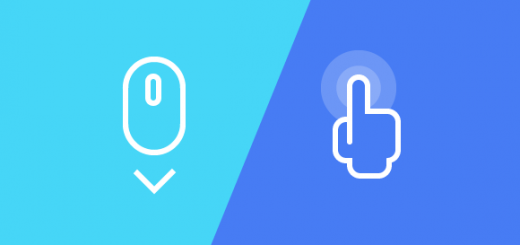
Get the User involved
As mentioned in the ‘Try something a bit different’ section of this post, we mentioned adding interactivity to your website. It’s something that has always made website more intriguing. However, adding interactivity doesn’t always mean add more fun buttons. But it can also mean ask them questions, let them sign up to useful information or a updates to your ‘site. Simply adding in some user input on their end will have them coming back to interact once again.