5 Web Design Trends to Look for In The Future

For web designers and even developers, keeping up with where web design is going is to key to ensuring the best website experience for their users. Everybody wants their website to be the best-looking, best user experience on the web. Therefore, it’s essential to know what users want and what techniques you should be using when designing your website.
Luckily for you, we here at Geeks Zine have done our research and had a look at what design trends you should expect to see over the coming years. We’ve narrowed this list down to 5 examples that will give you some ideas of things to make note of when designing your next website, whether it be for a client or for yourself. So here at 5 web design trends to look for in the future.
 Less Clicking – More Scrolling
With the advancement in mobile technology and the use of mobile screens being higher than ever, expect to see less clicking and more scrolling. With web designers thinking more of their mobile audience, it’s far easier to scroll a page and click on the occasional button than it is to be constantly clicking to different links to access different content, different pages or just different sections of your website.
One-Page designs are becoming a massive part of the web with the ability to select from a menu along the top but the result auto-scrolling you down the page as opposed to taking you to a different one. This obviously works the same as you scroll down the page, the different menu sections get highlighted to show you which part of the content you’re reading or viewing.
Simplify Your Page As Users Spend Less Time There
 Simplify Your Page As Users Spend Less Time There
A recent study showed that 1 in 4 people will abandon a page if it fails to load within the first 4 seconds of them having clicked on the previous link. In fact, around 40% (nearly half of people) will abandon the website if it hasn’t loaded in 10 seconds. This result shows that people these days are becoming far less patient in a world with high-speed internet expectations.
As a result, you need to work on making sure your landing page and indeed the rest of your website is as snappy and responsive as possible. It’s key to ensuring that once a user has clicked that Google link to access your web site that they are seeing a majority of that content within 5 seconds. If you actually count it out, 5 seconds is a fairly long time for a website to load in this day and age so it’s not an incredible high expectation. Cut down on the incredibly high-resolution images, cut down on the ads and work on white-space and simplifying your website but keeping it modern and stylish.
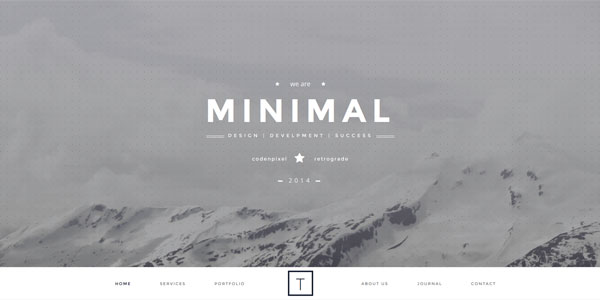
Full-Screen Image Titles
 Full-Screen Image Titles
Without a doubt, imagery, and media in general, has seen a huge increase within website over the past few years. We’ve seen videos become quicker than ever to load, we’ve seen social media blow up with images, Vines and more to express everyone’s opinions and lives. Website have been the exact same with images getting bigger, videos being used as backgrounds for landing pages and even more media-based content.
Expect this trend to stay and even grow. Just stop and go to a website that offers up a block of text on their landing page, then go to a page that offers up a large image or a full-screen image with a title overlay on their landing page. Which is more appealing to your first impressions, which one suggests thought and passion went into making this website look good and feel welcoming?
Higher Resolution Images
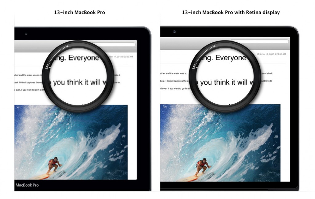 Higher Resolution Images
We’ve seen a horrible trend over the past years of website trying to optimise their images on their website to load as quickly as possible by lowering the resolution so it looks okay on a 1080p display. However, we are coming into a world of retina displays, 4k monitors and 2k smartphones. Therefore, the use of higher imagery detail and resolution is a necessity. In fact, not just images but anything that requires a bitmap image including iconography, some text and layouts.
The best example right now is Google’s Material Design. Google are priding themselves on creating a design that scales beautifully no matter which resolution or screen size you have. Google’s take means websites load faster, and scale the icons to any size without losing the quality. As a result, this makes them ideal for web designers and modern web browsers.
The Return Of Animation
A few years ago, if we told you that a website consisted of a load of animation, your first instinct would be that it took ages to load and looked cheap covered in GIFs and Flash animations. However, with the advancement of smartphone UIs and their interesting take on utilising animation to present more information in smaller spaces, animation is seeing a rise once again.
Mobile applications these days use animation to slide out more information such as text or a menu or bring out more buttons or options. Website are beginning to do this too to allow them to keep their design and load times down but present the same level of information as before.
We’ve also seen a massive rise in GIFs lately. The GIF has become far better optimised and utilised within the web. GIFs used to be pointless, slow-loading rows of images that offered little purpose other than some minor creative uses. GIFs these days are a great way of presenting a video or short animation without having the user load a YouTube video or an entire segment of a video to show them.

