10 Web Design Turn Offs

Web designing is a dynamic field which requires a well capable aesthetic sense, relevant technical skills and the ability to produce quality content. At one time it is an art and at another time it is science. While there are numerous factors which help in attracting the attention of the visitor, there are some which can completely turn them off. It is necessary to avoid these while designing a website.
1. Poor Navigation
One of the reasons a visitor is annoyed by website design is the poor navigation interface. Sometimes it is too animated which hides the required details. Yet at other instances there aren’t enough links to get the most wanted pages. If you don’t have enough space you can add some links at the bottom of the page.
[post_ads_1]
2. Dead or Broken Links
It is very irritating to find a good piece of writing with embedded links which are dead. This leaves a bad taste in reader’s mouth and he/she may never return to the website.
3. Heavy Flash Content
Sparing use of flash is perfect to adorn a website but some over enthusiastic web designers produce a website entirely made up of flash content. They are really slow to load and badly affect the browsing experience. You are bound to lose all the visitors who don’t have broadband connections if you have made a fancy website with nothing but flash contents in it.
4. Lack of Clarity in Content
Users need information to take a decision. You might have written a great piece full of information and no one can question about the relevance. But still you will miss out most of the readers if it is not presented well. Use paragraphs of uniform length, with headings and enough space in between the paragraphs. Don’t write more than 5 to 6 lines continuously. Readers are looking to skim the information and you should give them a maximum chance to do so. Yes, they need to breath too!
5. Browser Compatibility
One of the hot issues which many web designers neglect is the compatibility of website for different browsers. If the user is required to install plug-ins then most probably he/she won’t install or will not know how to do it. Run your website on all the browsers before letting the world see it.
6. Pop Ups
Ask any common user and the answer will be pop up advertisement. Many people do enjoy ads as TV commercials or even in newspapers and magazines but they will hate sliding ads on their computer screens. You may think it to be a perfect tool to force a user to click with sticky ads or else h/s won’t be able to access the content. But most of the users will click the back button instead.
[post_ads_2]
7. Subscription Form’s Length
Many online businesses try to attract customers through Newsletter subscriptions. Whilst there is nothing wrong in it from a business point of view the amount of data to be received from the user should be minimal. Research has shown that when greater number of field entries is required from the visitors they are going to turn off more frequently.
8. Long & Wide Web Pages
It is taxing on the user’s mind and fingers to scroll down and read long pages. Pages should be no longer than three times the screen size. Similarly set the screen resolution to 1024x 768 pixels. PC or laptop users will have to use bottom scroll bar if the width exceeds for this common resolution. This breaks the concentration and thus the interest.
9. Unprofessional Writing
Websites with content having poor grammar and punctuation will be the least credible in the eyes of the user. Remember, website is not an SMS text. You can’t use short cuts or casually abbreviated versions of words to avoid typing.
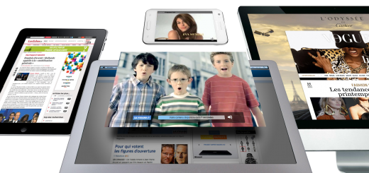
10. Unfit Graphics
Having high resolution images is one thing but using abnormally large image sizes is another. Similarly tiny images which are hard to see are also undesirable. If you are using an illustration it should be harmonious with the theme of the website.
There can be more turn offs for users. The key for web designers is to be in the shoes of the viewer and design every element accordingly.
[leaderboard_bottom_ads]