15 Weird Logos of Companies Before They Became Popular

Some companies over the years have garnered a logo that makes them instantly recognisable even without having to add their company logo on the brand. It’s these sort of logos that took a lot of iteration and often minor design changes to keep themselves contemporary and modern. However, a lot of famous company’s logos began with quite a strange idea and we’ve decided to show you some today. Here are 15 weird logos of companies before they became popular.
Apple
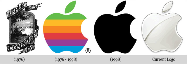
Without a doubt the biggest brand in the world right now is Apple, with every device they release breaking records all over the place, they are simply a giant. As a result, their logo has become recognisable by almost everybody you meet, despite simply being an apple with a bite having been taken out of it. However, back in 1976, their first logo was an odd design and one we don’t think anyone would recognise today.
BMW
Another company that are leaders in their field is the German car manufacturing company, BMW. Now, their logo is recognisable by almost everybody on the fronts and backs of cars and despite not having had much changed, back in the 70s and 80s they had a very odd design that offered some almost contemporary today style choices, but not anything that would look good on the front or back of a car today.
Shell
Shell is a massive gas station company that has a logo that is recognisable by anyone looking to pull in and fill their cars up with gas. However, would you have recognised their logo back in their incarnation in the 1900? The design looks to be a 3d drawing of simply a shell, far from the bright and minimal logo that represents the brand today.
NIKE
Nike are without a doubt one of the biggest, if not THE biggest sportswear brand in the world and have a logo that may be more recognisable that any in the logo despite it’s incredible lack of description. However, back in 1971, Nike decided to plaster their brand name across the front of the tick in a very odd font and using colours that almost matched the rear design itself, very odd.
KODAK
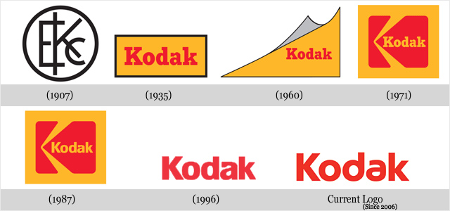
Often you find that the older the brand, the more odd their logo used to look. However, with Kodak’s logo back in 1907, it offered quite a surprisingly contemporary design with sanserif fonts engulfed in a simple circle. However, it is nowhere near as simple and modern as the logo they use today, which is a simple representation of the brand name in their own font.
Volkswagen
Along with BMW, Volkswagen are one of the most highly respected car brands in the world and have another logo that is very recognisable. However, back in 1939 their logo design was incredibly odd with a very trippy and confusing design about the VW logo which you see them use just before WWII.
Mozilla FireFox
One of the top browsers on all computers, doing well to keep up there with the likes of Google Chrome and Safari is Mozilla ForeFox. However, we don’t know how well it would have done if it had stuck with its original logo back in 2002. It appears to be some kind of a fire bird bursting from the flames, definitely not what people want in their dock.
Pepsi
Pepsi is one of the oldest brands on this list still going today with its first logo dating back to 1898. As you can see, the design used to be very similar to Coca-Cola and we’re almost certain that this was the reason that the logo and the design received so many reiterations over the years to finally narrow it down to the minimalist and recognisable logo we all know and love today.
Microsoft
Microsoft pioneered making the computer more affordable and accessible to the mainstream market and whilst doing so and had quite a few reiterations of their logo. It began with a curly font that looked quite complicated and awful and even included a green background at one stage in 1975 and then slowly formed into the logo that shows up at the boot-up of most computers in the world today.
Canon
Canon’s transformation is more than just on the surface, it appears they went through a name change too, going from “Kwanon” to the “Canon” we know today. Along with this, the logo went through some really interesting design changes too, but 1934 is the best logo by far with the most elaborate design and the fact the logo states ‘Camera’ to ensure people knew what the brand produced.
Mercedes
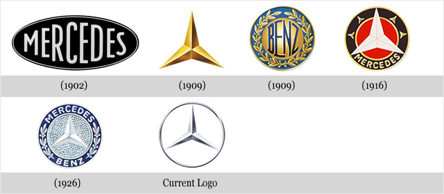
Mercedes are one of the oldest and greatest car manufacturers in the world. Their name exudes class and their cars do too, however the boring logo back in 1902 doesn’t suggest anything classy and more simple. As you can see, they’ve gone through quite a few design changes, but have stuck with the one we know today for almost 90 years now, which is great as it is a truly beautiful and minimal logo and represents the brand perfectly.
Ford
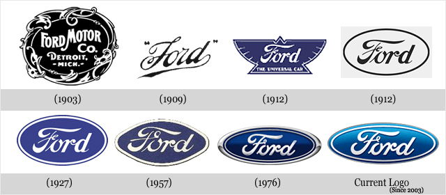
Ford are well known for being the first company in the world to mass-manufactured cars for the public and the Ford T1 is said to be the first TRUE mass-manufactured car that people loved to own. The logo since the first T1 has changed quite a lot going from a complex logo with interesting graphics to the simple oval with the ford font in the middle that everybody recognises on the front and back of cars today.
NOKIA
Nokia may have fallen away in recent years due to not adopting Android as their main operating system and choosing to go with Windows Phones. However, due to their incredible previous respect they are the ONLY Windows Phone you want. As you can see, their logo has had some incredibly weird stages, including being a fish back in 1865. Thank god they got rid of their fish fascination.
LG
LG are another brand that has suffered from the power of Samsung and Apple in the smartphone world, but there’s no doubt that they still make incredible TVs, Kitchen appliances and more. Their Logo has definitely changed and has gone through some incredibly odd design and even name changes, including being called Goldstar at one point. Apparently LG stands for the original makers initials, but they’ve attempted to rebrand it as standing for Life’s Good with the western world in recent years.
Finally, we couldn’t have a look at weird logos without mentioning Google’s offering back in 1998 when they first came about. Not only does their logo look childish and far too colourful, but it looks like something anybody could have made using Microsoft’s infamous WordArt feature in their Microsoft Word programme. Their logo is now flatter and even more modern than ever and there’s no doubt they’re one of the biggest and most well-known companies in the world.


