20 Awesome Minimalist Logos for Inspiration
So you’re looking to design a new logo for either your existing company or your brand new company and want it to keep up with contemporary design and keep it minimal. There are lots of incredible examples of minimal logos out in the world and we’re going to show you 20 minimalist logos for inspiration today to hopefully help you to create your own and give you some ideas.
Farmhouse

Farmhouse is a beautiful minimal logo that uses a set of three main colours that then use a low opacity to blend the colours together. These circles are all cut off in the middle to show the shape of a house. Clever, but simple.
Pagepro
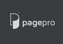
Pagepro is a brilliant logo design that utilises a style a lot of logos uses these days which is to use two simple colours to signify a 3d image.
Koala Ranch

This logo intrigued us as it offers up a beautiful minimal design of a Koala that is easily recognisable as the animal itself but uses barely any detail to show this. This is clever artistic work at it’s best and would be great to replicate for anyone looking to create animal logos.
Lark Insurance

What we like about this minimal logo from Lark Insurance is that it uses a simply use of the word Lark, but then within the ‘R’, it uses an image of the Lark bird. It’s something that could possibly be missed of quickly looking at the logo but adds a touch of uniqueness and friendliness to the logo.
Rechargeable

This is a beautiful minimal logo that manages to get what the company aims to achieve across really well. It uses a simple but beautiful design of just a lightning bolt which represents the electricity and then the intelligent use of the arrows to signify the fact of rechargability.
William & Son

We liked this logo from William & Son because it manages to encorporate a ‘W’, ‘S’ and ‘&’ all into the logo using some clever thinking. At first it may be hard to pick these all out, but if you look long enough you can find them all and it works really well.
Beyon

Beyon utlises a classic old design and idea when it comes to creating logos. Take the first letter of your company’s name (usually with shorter company names) and try and play around with it until it still looks like the letter but has it’s own unique twist.
BlueMountain

BlueMountain uses a similar technique to the Lark Insurance logo where they have an image already and then uses a white or almost cut-out foreground to highlight the section that their company represents.
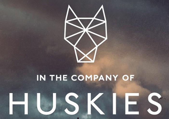
In Company of Huskies

This logo uses a very simple design that almost looks like origami to represent the husky side of their company. It’s a minimal design that uses only simple lines which represent the creases in the paper of the origami.
Animal Defense League
 This logo is clever and brilliant for two reasons: it uses two-colours but has two images and the outline of the cat’s tale also represents the space between the dog’s legs. It’s a really well-worked logo and is a brilliant idea for any use-case scenario.
Kix Box

Kix Box is a really nice logo design for multiple reasons. It first off uses a brilliant colour palette that gives the look of a creative service. Secondly, it uses the whole text using the clever set of straight lines that clearly signify something to do with the service. And finally, it just looks modern and minimal.
Filmaps

Filmaps is a great logo design because it encoporates the two different aspects of its service within one simple graphic. The graphic is obviously a pin mark for the map and then a film reel along the top for the film aspect.. clever.
Folder

Folder is another really clever design that uses a clever perspective design that shows off the F from the name, but also works out to be a set of draws as well which signifies what the company offers. A simple but brilliantly clever design.
OneFund

OneFund actually uses a very similar idea with the perspective side of design. The far left section of the logo appears to be the side of the ‘F’ for ‘Fund’ but also works out to be the number ‘1’ for the ‘One’ section of the name. Once again… very clever.
Fence

This is another clever logo that uses the words to represent what the service offers. It’s a little hard to pick out at first, but you can see that the letters are represented using fence posts themselves which is a really clever and simple way to represent their product and offerings.
Frankenstein Films

This logo is quite fun in that it uses the idea of a film roll again, similar to Filmaps but this time it uses the same colour and uses shape of the Frankenstein’s head which is quite a novel and fun way to use your logo.
Freedom

This logo which is meant to represent Freedom uses a simple idea to express freedom by having the top of the ‘m’ disconnect from the rest of the word which shows that the top of the letter ‘m’ is now free from the horrible constraints of the rest of the word.
CodeFish

This logo is one of our favourites as it cleverly utilises script language that you would use when it comes to coding to create the look of a fish. It’s a really simple but clever idea and one that really makes you feel there’s some intelligence behind the company that created it.
SewPerfect
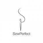
Not only is the name of this logo a play on ‘So Perfect’ but the actual graphic itself is clever. To the naked eye, it just looks like a thread and needle, but if you look closer you can see that it is actually the letter ‘S’ and the letter ‘P’ all within the same graphic.
Foot

Finally, we have one more really clever design that shows some creativity on the designer’s part. As you can see, the word ‘Foot’ has the look of a footprint to represent the two O’s in the middle of the word. It’s clever, simple and minimal… which is almost a summary of all these logos we’ve shown today.
